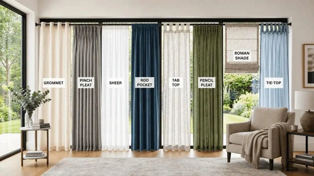


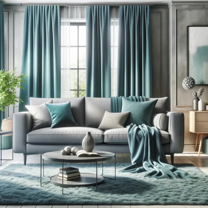
It’s not just a matter of picking the colour you prefer for curtains. The curtains must complement the walls, sofa, flooring, rugs, furnishings and the amount of natural light in the space.
Many get stuck on this part. Sometimes the curtain looks amazing in the store, but just doesn’t seem to fit or seems too dark or too plain at home.
The bright side is that it is not necessary to match everything up. In the majority of rooms, it’s more effective to match colours, tones, textures and contrast amongst curtains and the interior of the room, with a view to making curtains part of the interior.
If you are decorating an office, living room, bedroom or apartment in Dubai, these rules will help you select curtains that will complement your existing interior decoration and wall colours.
Start With the Colours You Already Have

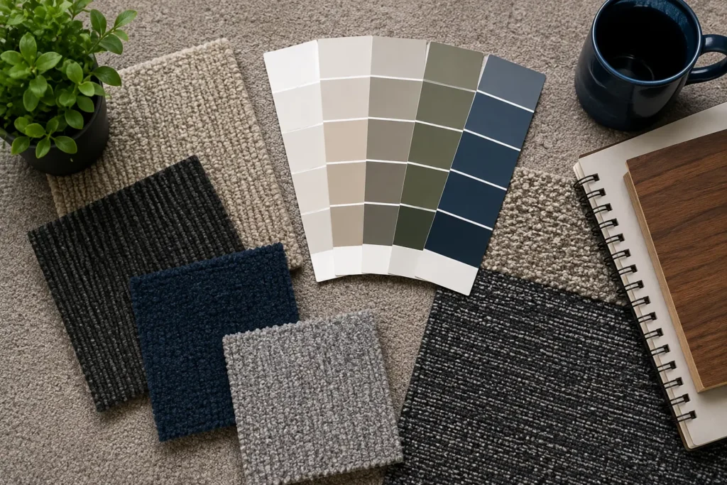
Before choosing curtain fabric, look around the room.
Identify the three main elements:
- Wall colour
- Main furniture colour
- Flooring or rug colour
These create the foundation of the room. Your curtains can then either blend with these colours or provide a controlled contrast.
For example, imagine a living room with:
- Warm beige walls
- A cream sofa
- Light oak furniture
- A neutral rug
Instead of choosing another strong colour, you could use ivory, sand, taupe, oatmeal, or soft beige curtains. The room will feel calm and connected without everything looking identical.
On the other hand, if the walls and furniture are all neutral, curtains can introduce more personality through muted green, dusty blue, charcoal, terracotta, or another carefully chosen accent.
Should Curtains Match the Walls or Furniture?
There is no single rule that works for every room.
A useful starting point is to decide what you want the curtains to do.
Match the Walls for a Calm, Spacious Look
Curtains that are close to the wall colour can make a room feel more continuous. This is especially useful in smaller apartments or rooms where you do not want the windows to become the main visual feature.
For example:
White walls: ivory, cream, light grey, beige, or soft taupe curtains.
Beige walls: sand, oatmeal, cream, warm grey, or slightly darker beige.
Light grey walls: silver grey, charcoal, greige, white, or muted blue.
Cream walls: ivory, camel, warm beige, olive, or soft brown.
The curtain does not have to be the exact same shade. A difference of one or two tones usually creates enough depth.
Match the Furniture for a More Connected Interior
If your sofa or armchairs are the strongest feature in the room, you can take inspiration from them.
Suppose you have a dark green sofa. You do not necessarily need dark green curtains. A softer sage, warm beige, cream, or muted olive can complement it without making the room look overly coordinated.
For a navy sofa, consider:
- Light grey
- White
- Warm beige
- Soft blue
- Greige
For a brown leather sofa, consider:
- Cream
- Linen
- Sand
- Taupe
- Warm grey
- Olive
The idea is to repeat the colour family, not necessarily copy the exact colour.
Use the 60-30-10 Rule as a Guide
The 60-30-10 approach is useful when you are unsure how much colour to introduce.
Think of the room roughly like this:
- 60%: dominant colour, usually walls and large surfaces
- 30%: secondary colour, often furniture, flooring, or larger textiles
- 10%: accent colour, used in cushions, artwork, accessories, or curtains
You do not have to follow these percentages literally. They simply help prevent a room from becoming visually crowded.
For example, if your room is mostly cream and beige, dark charcoal curtains might become too dominant. A medium taupe or textured linen curtain could provide enough contrast without taking over the room.
If the room already contains several neutral tones, however, a deeper curtain colour can work as the 10% accent.
Match Curtain Colours to Different Wall Colours
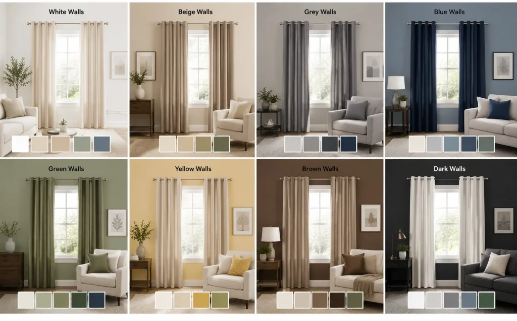
Wall colour is one of the easiest places to start.
White Walls
White gives you plenty of freedom.
You can use white-on-white curtains for a clean, minimal interior, or introduce contrast with beige, grey, navy, olive, brown, or charcoal.
If your furniture is also light, textured curtains can be more interesting than simply choosing a darker colour. Linen-look fabrics, subtle patterns, or gentle folds can add depth without making the room busy.
For a softer Dubai apartment interior, warm white or off-white curtains often work better than an extremely bright white.
Beige Walls
Beige walls pair naturally with warm neutral curtains.
Good options include:
- Cream
- Ivory
- Sand
- Taupe
- Mocha
- Warm grey
- Olive
If the sofa is also beige, avoid trying to find an identical beige. Instead, choose a noticeably lighter or darker tone.
For example, beige walls with a cream sofa can work beautifully with taupe curtains.
Grey Walls
Grey walls can go in several directions depending on whether the grey is warm or cool.
Cool grey works well with:
- White
- Silver
- Charcoal
- Dusty blue
- Navy
Warm grey or greige works better with:
- Beige
- Cream
- Taupe
- Brown
- Soft olive
If your grey walls already feel quite cool, adding warm beige curtains can make the room feel more comfortable and less sterile.
Dark Walls
Dark navy, charcoal, forest green, or deep brown walls create a stronger backdrop.
You can either continue the dramatic look with similarly rich curtains or soften it with lighter fabrics.
For example, charcoal walls with cream furniture can look balanced with:
- Ivory curtains
- Warm beige curtains
- Light grey curtains
- Linen curtains
If both the walls and furniture are dark, lighter curtains can prevent the room from feeling visually heavy.
What If Your Furniture Is Patterned?
This is where restraint helps.
If your sofa has stripes, floral prints, geometric designs, or another strong pattern, plain curtains are usually the safer choice.
Pick one colour from the furniture pattern and use a quieter version of that colour for the curtains.
For example, if a patterned sofa contains beige, olive, and cream, you could choose plain olive or cream curtains.
You do not need another pattern competing with the sofa.
The same rule works in reverse. If your furniture is plain, patterned curtains can introduce some visual interest.
Think About Curtain Texture, Not Just Colour
Two curtains can have almost the same colour and still create completely different impressions.
A smooth polyester curtain may feel crisp and modern. Linen has a more natural, relaxed texture. Velvet looks heavier and more formal. Sheer fabrics keep the window visually light.
This is particularly important when your walls and furniture are already similar in colour.
For example, a beige room with beige furniture and beige curtains could look flat if every surface has the same smooth finish. Adding a textured linen curtain gives the eye something else to notice.
When Should You Choose Sheer Curtains?
Sheer curtains are useful when you want daylight to remain part of the room.
They work especially well with:
- Large windows
- Living rooms
- Dining areas
- Neutral interiors
- Modern apartments
- Rooms where heavy curtains would feel too dominant
Sheer curtains can also be layered with heavier curtains. During the day, you can keep the sheer layer closed for softer light and some daytime privacy. In the evening, the heavier curtain can be drawn for stronger privacy and light control.
When Do Blackout Curtains Make More Sense?
Colour is important, but function should not be ignored.
Bedrooms, media rooms, and spaces exposed to strong sunlight may need better light control. In these rooms, blackout curtains can be a practical choice.
You can still coordinate them with the furniture and walls.
For example:
- Beige bedroom + cream furniture → taupe or warm beige blackout curtains Grey bedroom + white furniture → charcoal, grey, or soft blue
- Cream bedroom + walnut furniture → mocha, taupe, or ivory
- White bedroom + dark furniture → light grey or textured beige
If you want a layered arrangement, blackout curtains can sit behind sheers on a dual-track system.
Matching Curtains With Wooden Furniture


Wood adds another colour family that people sometimes overlook.
Light oak, walnut, mahogany, and darker wood finishes each have a different visual temperature.
Light Wood
Light oak and similar finishes work well with:
- White
- Cream
- Beige
- Soft grey
- Sage
- Light blue
Medium Brown Wood
Try:
- Taupe
- Beige
- Cream
- Olive
- Warm grey
- Rust or terracotta accents
Dark Wood
Dark furniture can be balanced with lighter curtains such as:
- Ivory
- Cream
- Sand
- Light beige
- Soft grey
If you pair dark wood with dark curtains, make sure the room receives enough natural or artificial light so the overall interior does not feel too heavy.
Do Curtains Need to Match the Sofa Exactly?
No.
In fact, exact matching can sometimes make an interior look too predictable.
A better approach is to create a relationship between the two.
Here are a few easy combinations:
| Sofa Colour | Curtain Colours to Consider |
| Beige | Cream, taupe, ivory, olive |
| Grey | White, charcoal, beige, dusty blue |
| White | Beige, grey, taupe, muted colours |
| Navy | White, beige, light grey, soft blue |
| Brown | Cream, sand, taupe, olive |
| Green | Cream, beige, sage, warm grey |
| Black | White, ivory, grey, beige |
Treat these as starting points rather than strict rules. The exact shade of the wall, flooring, lighting, and furniture finish can change the result.
Use Rugs and Cushions to Connect the Colours
Your curtains do not have to carry the entire colour scheme.
Rugs, cushions, throws, artwork, and decorative accessories can create the connection between different colours.
Imagine a room with:
- Beige sofa
- White walls
- Dark wooden table
- Blue patterned rug
Instead of choosing blue curtains simply because the rug contains blue, you could choose soft beige or ivory curtains and repeat the blue through cushions or artwork.
This creates a more relaxed colour flow.
If you choose curtains with a strong colour, use small accessories in the same colour elsewhere in the room. Even two or three subtle repetitions can make the colour feel intentional.
Consider Dubai’s Natural Light Before Choosing the Colour
A curtain colour can look very different depending on how much sunlight enters the room.
A bright, south- or west-facing room can make pale fabrics appear even lighter during the day. Strong sunlight can also make certain colours feel warmer.
Rooms with limited natural light may benefit from lighter curtain colours because they reflect more available daylight.
Before ordering, look at your fabric samples at different times of the day.
A colour that looks perfect under showroom lighting may appear noticeably different in:
- Morning sunlight
- Afternoon sun
- Evening artificial lighting
This small step can prevent an expensive colour mistake.
Should Curtains Be Lighter or Darker Than the Walls?
Both can work.
Choose lighter curtains when:
- The room is small
- You want a brighter interior
- Furniture is already dark
- You prefer a soft, airy style
- The walls are strongly coloured
Choose darker curtains when:
- The room is large
- Walls and furniture are very light
- You want stronger contrast
- You want the windows to become a feature
- The interior has a more dramatic style
If you are uncertain, a curtain that is one or two shades lighter or darker than the wall is usually easier to work with than an extreme contrast.
A Simple Way to Choose Curtains Before You Buy
If you are standing in a showroom surrounded by fabric samples, use this five-step process:
1. Take photos of your room
Include the walls, sofa, flooring, rug, and furniture.
2. Identify the dominant colour
Ask yourself what colour occupies the most visual space.
3. Choose your curtain role
Decide whether the curtain should:
- Blend in
- Add contrast
- Add colour
- Add texture
- Provide stronger light control
4. Compare fabric samples at home
Hold the samples next to the wall and furniture rather than judging them on their own.
5. Check the fabric in daylight and at night
This is particularly important for darker colours and rooms with strong Dubai sunlight.
Should You Choose Curtains Before or After Furniture?
If you are starting a room from scratch, it is usually easier to select the larger, harder-to-change elements first.
Start with the flooring, major furniture, and wall colour. Then choose curtains that connect these elements.
If your furniture is already installed, however, curtains can become a useful way to bring the room together.
For existing interiors, take your sofa fabric, wall colour, rug, and flooring into account before choosing the curtain.
When Two Curtain Colours Work Better Than One
Layering can be useful when you want both softness and practical light control.
A common arrangement is:
Sheer or linen layer + blackout layer
During the day, the lighter layer filters the sunlight. At night, the blackout panel provides greater privacy and darkness.
This approach is especially practical for bedrooms and large living-room windows.
The two layers do not have to be identical. You could combine warm white sheers with taupe blackout curtains, for example.
The double-layer curtain approach can also work well when you want the room to look softer during the day without sacrificing privacy at night.
Common Curtain Matching Mistakes to Avoid
Matching every colour exactly
A beige sofa, beige wall, beige rug, and identical beige curtains can make the room feel flat.
Use different tones or textures to create depth.
Ignoring undertones
Two shades can both be called “white” while one is cool and the other is warm.
Warm furniture usually works better with warm curtain tones.
Choosing colour from a small screen
Online photos are useful for narrowing down options, but fabric samples are more reliable for the final decision.
Forgetting the floor
Flooring occupies a large visual area. A curtain that works with the walls but clashes with the flooring can throw off the entire room.
Choosing a curtain only because it looks fashionable
A beautiful curtain is not necessarily the right curtain for your room. Think about sunlight, privacy, fabric weight, cleaning, and how the colour will work with your existing interior.
Final Thoughts
The best curtain colour is rarely the one that matches a single item perfectly. It is the colour that makes the walls, furniture, flooring, and accessories feel like they belong together.
Start with the colours already in your room. Then decide whether you want the curtains to blend in, create contrast, add texture, or become a feature.
For Dubai homes, also consider the amount of sunlight entering the room and whether you need simple light filtering or stronger blackout performance.
And if you are unsure between two colours, do not rely on a catalogue image alone. Take fabric samples home, place them beside your sofa and wall, and look at them in both daylight and evening lighting. That small test can make the final choice much easier.